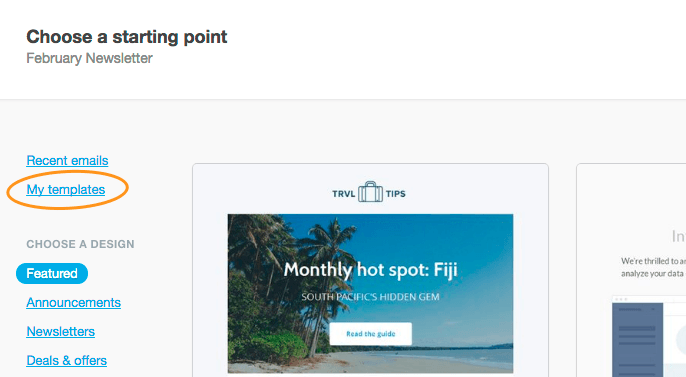
To use the email builder, you first need an email builder template. You can then select that template from My templates when creating a new campaign, journey, or transactional email.
Email layouts
The structure of an email is made up of three parts: the header, body, and footer.
Header
The header can contain:
A logo
Preheader text
A "view in browser" link
Body
A body is made up of sections. Sections are where you place content like text, images and buttons, and are available in the layouts shown in the image below:
You can add as many sections as you like, and arrange them to create engaging and clever layouts. Individual sections can have different background images, background colors, and column padding options. Spacing below each section can be adjusted.
You can also make individual sections visible only to specific audiences, by assigning them to specific lists or list segments. We call this dynamic content.
It is not possible to merge or split columns in a section layout, but you can add the new section type you want to your layout and copy across content from the old section.
Footer
To open the footer settings in the left sidebar, click anywhere in the email footer.
A footer contains:
A company name and address to comply with anti-spam regulations.
An unsubscribe link.
It optionally contains:
A subscriber preference center link (Other settings > Edit subscription).
An explanation as to why a subscriber is receiving the email, useful as a permission reminder (Other settings > Explanation text).
Links to your social media presence (Company details).
Links to share the email on social media (Share this email).
Subscriber preference center and unsubscribe links are not available in transactional emails.
Email settings
Permission required to use this feature: build or import your own templates
In addition to logo and header settings, the "Settings" menu in an email is where you set:
email-wide styles, including colors and fonts.
vertical spacing for all sections.
the language for the email sharing buttons, and the unsubscribe, view in browser, and preference center links.
You can access the "Settings" menu by clicking the cog icon in the "Build" menu on the left.
People without the build or import your own templates permission will only have the option to edit the preheader text and "View in browser" link from the settings menu, providing the header has not been locked.
Email content
You can drag content blocks, like text and image, from the "Build" menu on the left into the columns in each section.
There are multiple types of content blocks you can add, as described below.
Text
Choose from multiple styles, typefaces, alignments and colors. Add links and personalized content to your emails.
Images
Upload an image from your computer, or link to an image on a web server, opening up the possibility for personalized images. After it's uploaded, you can edit the image directly in the email.
Spacers and dividers
Dividers are a fixed-size content block that contain a centered line, used to separate content.
0:04
A spacer is a blank, adjustable content block. It inserts a column-wide vertical space that helps to vertically position other elements.
Buttons
Buttons serve as a call to action, and link to somewhere on the web. They are highly customizable.
Videos
Most email clients don't support playing video. However, with the email builder's video block you can insert a YouTube or Vimeo URL, and a screenshot with a superimposed play button will be automatically generated, and linked to your original video.
Preview and test
To preview your email content while working on it, click the Preview button at the top right. This shows how your content will look on both desktop and mobile.
To test your design as you go, you can send an email to a single address by clicking Send a test email, next to the "Preview" button.


